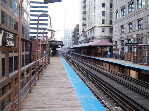
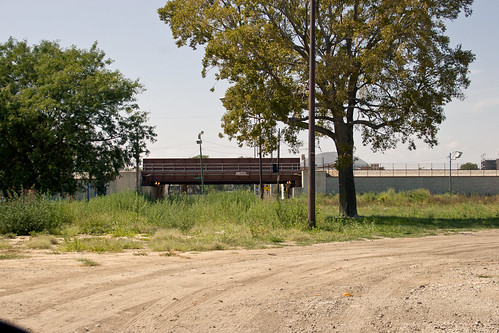
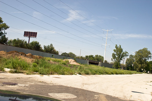
Many times Chicago planned to replace the downtown Loop elevated tracks with a subway. The famous 1909 plan for Chicago called for building subways. Again in 1939, this time after construction begun on Chicago's first (and only) subway lines, the city planned to replace the Loop. Again in 1958, 1962, and 1968 there were plans to build a new subway line downtown with the goal of replacing part or all of the elevated tracks. These last plans in 1968 illustrate some of the issues that faced replacing the Loop:
The CUTD prepared to begin work on the Franklin Street
Subway, beginning the process of selecting contractors and
undertaking initial tasks such as taking soil core samples.
But then an interesting thing happened: some people began to
talk of keeping the Loop
Elevated. The reasons for doing so were varied,
depending on who was advocating it: some felt the CCATP was
too expansive and didn't provide enough return on the
investment, other felt that the Loop
structure was sound and with improvement could continue to
serve its original function, and still others felt the
Loop was a
historic landmark of engineering and Chicago development and
should be preserved. Some compared the Loop's
cultural impact and association with Chicago to San
Francisco and its cable cars, while the Chicago Chapter of
the American
Institute of Architects compared the engineering
significance of the elevated structure to that of the Eiffel
Tower.
Since then things have changed and new innovations in repurposing old forms have given rise to interesting ideas. Most relevant is New York's Highline. It's success in repurposing an old elevated freight line in Manhattan to park space has been a huge success for the city. Not surprisingly other cities are wisely looking to emulate New York's success.
In Philadelphia, an old freight and passenger rail line called the
Reading Viaduct winds above the streets and between buildings just north
of the city’s center. Just like the High Line, the trains stopped
running decades ago, and since then nature has taken over the tracks.
The self-seeded landscape has inspired some local residents to join
together to advocate for the historic structure to be transformed into
public open space.
Chicago too has repurposed an elevated freight line, the Bloomingdale Line. One big difference is that the Bloomingdale Line doesn't travel to or through downtown in the same way as the Highline.
All of this background material is to suggest that Chicago should make a large plan. One that will incorporate the city's heritage as well as build upon its existing infrastructure in a way that will maximize the city's potential. I know that the financial hurdles will probably keep this vision from ever becoming a reality. But if downtown continues to grow the city should think about build a Wells St. subway line, eventually building a Lake St. subway line, and turning all that empty trackage into a park.
The current configuration of the Brown Line diverges from the Red Line at Fullerton. The Red Line descends, reaching its next stop at North and Clybourn underground. The Brown Line continues above ground in a route that twists and turns slowly. If you were heading to someplace inside the Loop, like Clark and Randolph, it is faster to take the Red Line at Fullerton rather than the Brown Line. They make the same number of stops but the Red Line travels faster. Indeed I know many commuters who transfer from the Brown Line at Fullerton and do just that.
But by building a subway line the follows approximately the Brown Line's path underneath Wells St. the trip would go much faster. Indeed putting a subway line underneath Wells or Franklin has long been an idea planners dreamed up for Chicago.
This plan is much more attractive, however, if it is coupled with repurposing the elevated trackage into a park.
One possible reconfiguration. At North and Clybourn the Red and Brown Lines diverge. The Brown Line will head south for the Loop. The Red Line will head east and then turn south and meet its old route at Clark and Division. From there the Red Line traces its old route through the Loop. The portion of Division running east-west could be used as a connecting service line, or the preliminary trackage of a long sought east west subway line on the Northside.
Alternatively, the Red Line could continue exactly as is and the Brown Line subway would cross at Division and Clybourn, and again reuniting at North and Clybourn, basically following more or less the current path but underground.
Finally, the Red Line will exit the subway from the old eastern subway portal on 14th between State and Wabash where it will take its former route on the Green Line tracks south. The Brown Line will follow underneath Wells through the Loop. New station configuration wouldn't necessarily be at exactly the same intersections as before. A new stop would be added where there is none in the South Loop. Possibly on Polk and Wells. From there the Brown Line will exit where the Red Line currently makes its exit from the western portal. From there it will follow the Dan Ryan tracks south.
Just building the Wells St. line could replace about 3.5 miles of elevated trackage, reduce transit times, and create about 3.5 miles of beautiful parkland on historic train lines. The neighborhood is already a dense, transit oriented community with plenty of places ready for more infill.
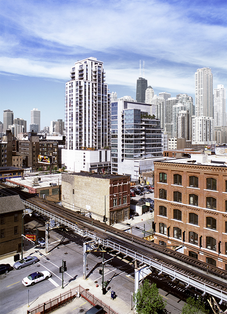
This trackage would become park space. As you can see there is a mix of old, dense building and open lots that are ripe for infill.
From there it would really only take building a few miles of subway line
to supplement the Blue Line tracks all the
elevated lines could be recirculated into a subway through the Loop.
The Green Line would descend, probably around the Kennedy Expressway,
and meet with the Blue Line tracks. Ideally the city would follow
through on long aspirated and recently proposed Clinton St. subway,
forming a perfect circuit. But even without that it would be possible to reroute all the elevated lines through the Loop with only the Lake St. subway tracks. From the Northside the Red and Brown lines are already covered. From the Southside the Green Line would descend through the Red Line's portal and become the new Red Line. The Orange Line would follow the Brown Line and, through a short Lake St. route emerge on the Westside and become the new Lake St. Green Line. The Pink Line could follow a number of possible routes as well.
Initially it would take building about 3.5 miles of Brown Line north of the river followed by 1 mile of new Lake Street subway, and 2 miles of subway inside the Loop to make this come to fruition. Ultimately around 7 miles of subway altogether. This would generate around 5.5 miles of park space in downtown Chicago, giving citizens and tourists alike a fabulous bird's eye vista of the city.
Again, the enormous costs of such a project makes it unlikely that it will ever be attempted, which is a shame. If the city's population and transit usage continues to grow, laying the foundation for a 21st century transit plan is more important than ever. The original State and Dearborn subway lines, totaling 7.7 miles, was estimated at 46 million dollars. In today's dollars that is roughly 7 billion 350 million dollars. Theoretically innovations in labor productivity should make building another 7 miles of subway should be much lower. Perhaps one day an innovative labor saving device to tunnel through the earth will make such a plan feasible. Until then Chicago residents will have to merely dream of an improved transit network and a magnificent Loop park.
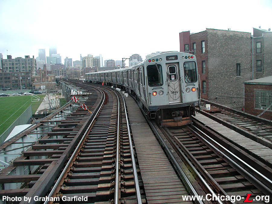
Imagine this similar to this
Make no small plans
Monday, October 8, 2012
Friday, September 7, 2012
New development: State and Harrison
There is a new development in Chicago's South Loop on the corner of State and Harrison. It is a high school. Replacing the old Jones prep school. I don't know the finer points of Chicago's education system or why a high school sits next to a subway stop, one of Chicago's 21 subway stations. But here it is. Possibly being centrally located is important for a magnate school that brings in students from across the city, but I don't really know.
On the map circled in red.
Across the street is an open lot parking facility and you can see the elevated green line tracks behind.
This too seems like a suboptimal use of space. Chicago has plenty of vacant lots next to L stations in less densely developed neighborhoods further from downtown that could be made into parking lots for park and ride. This lot is so close to downtown that one might not even ride. Just park.
Tuesday, September 4, 2012
Urban Farming
There is a new urban farm on Perry Street and 57th in Chicago's Washington Park neighborhood. The empty lot it occupies was previously a homeless shelter. You can read more about the project HERE. The lot is a city owned parcel near the historic John Raber estate being leased to a group with previous urban farming experience at the old Cabrini Green site.
I had the opportunity this weekend to make a quick pass though the neighborhood. First, a few notes about this neighborhood.
The area is near the Dan Ryan expressway and is fairly well served by the L; close to the red line on 63rd or Garfield, and also not too far from the green line at Garfield. The map shows the Metra running along the left side of the expressway. This is not correct. The Metra runs on the tracks that you can see right next to Perry Street. These are grade separated tracks, as you will see. The Metra does not stop in this neighborhood.
The Rock Island Line is elevated here, with no stops and no horns.
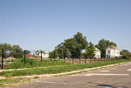
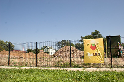
The tracks are opposite the farm. This empty field is currently nothing more than an empty field. Turning around you will see the farm, fenced in.
In what was once a dense residential neighborhood, now most lots are empty and most home vacant. They were once lovely Victorian style houses typical of early 20th century Chicago construction. Tall homes. Narrow lots.
Boarded up and overgrown.
The piles of tillage are fairly new, I am surprised they are starting something so late in the growing season.
As far as urban farming as a public policy for big cities to pursue? I am rather ambivalent. Taking a vacant lot and making it economically productive is preferable to having it lie fallow and cost the city in upkeep. Yet it seems like a suboptimal use of space, considering the transit options that exist in this area. The proximity to the expressway, a park, and rapid transit are somewhat wasted on farmland. It is similar to having an open lot parking site downtown. The location would be better used with a building on it, but a parking lot is better than being vacant. An urban farm is better than a vacant lot.
Wednesday, August 29, 2012
A closer examination of Chicago's industries
It is no secret that employment opportunities are a big draw for any city. Recently criticisms of Chicago's economy have begged the question: what exactly is it that you do here? Thankfully the Bureau of Labor Statistics has some resources we can use. First, a comparison between Chicago and Houston. They make apt comparisons because they are similar in population and they are both centrally located (both are in the Central time zone). Chicago is center north and Houston center south.
Chicago's year over year construction took a huge dive. Compare that with Houston, which saw a fairly large construction increase.
As you can see, Houston also profits from Mining and Logging, an industry that is really the accident of geography. Many cities like Chicago and New York don't have anything to mine or log nearby, while other cities like Los Angeles and Houston do. I should also note that Leisure and Hospitality went up considerably more in Houston than in Chicago. Education and Health Services went up more in Houston than Chicago. Even manufacturing saw better numbers for Houston. Really the brightest spot of comparison for Chicago was Professional and Business Services, which saw greater growth than Houston.
Keep in mind that Professional and Business Services was a strong point for Detroit as well. These graphs should be taken in context.
I hope you noticed the difference between this chart and the Chicago and Houston charts. Detroit only has 7 categories. Chicago has 10 and Houston has 12. Los Angeles has 11 categories. It would seem that a greater diversity of industries leads to a healthier overall economy.
One should keep perceptions of a city's economy in line with the statistics. Despite all the bluster of Hollywood as a "calling card" industry, Los Angeles is a manufacturing town.
As you can see, L.A. tops the list with more manufacturing jobs than Chicago. And you can also see manufacturing jobs took a tumble everywhere, but Houston was the only major manufacturing center to keep losses in the single digits. Thus far I have had difficulty parsing the numbers on Houston to determine how much of Houston's manufacturing jobs are in the petrochemical industry, aerospace, and semiconductor industries. Additionally I have no good statistics on how much of Chicago's manufacturing jobs are auto manufacturing or metalworking (or Detroit and L.A. for that matter). Recent news stories suggest that Houston's manufacturing is tied to the petrochemical industry.
And as much as L.A. is thought of as an entertainment mecca, good numbers on Hollywood's role in L.A.'s economy are hard to get but the best I can gather is 8.2%.
Also keep in mind that New York is still a top 10 manufacturing city. In fact it represents 16% of all private sector employment in New York, a not insignificant number.
Thus we can see that a key to having economic success in a city is not a "calling card" industry but rather having a diverse set of industries, especially in industries that are growing. Nationwide oil and gas extraction is a booming industry, so being located in that region would be really beneficial to your city. And this apparently spills over into manufacturing as well. Auto manufacturing and various metalworking industries have been in terminal decline for about 30 years. And while iron mining isn't quiescent in the upper Midwest it is a shadow of its former self.
As a counterpoint to this, much of Chicago's economic malaise is tied to the decline of manufacturing. For Chicago, manufacturing itself was initially an accident of geography that lead to its meteoric rise. Chicago happened to be located in a region rich with iron ore and copper, as well as lumber, coal, and navigable bodies of water. As it happened the iron and copper mining exhausted themselves and the region's manufacturing lost their comparative advantage.
Much like New York, Chicago has found that as manufacturing declines it relies more heavily on these other industries to pick up the slack. The challenge for Chicago, as with New York, is for the seeds of new industries to take root. For New York, the tech sector is ramping up in "Silicon Alley". Chicago, as usual, is want to follow in New York's footsteps.
Wednesday, August 1, 2012
The illusory nature of urban decline
The narrative around Rust Belt cities tends to follow the same formula. Chiefly it is the decline of manufacturing in the Upper Midwest that caused the declining population and fortunes of the cities therein. However, I would like to propose an alternate view. Instead, I would suggest that the decline of Midwestern cities is in some ways illusory. Many of these cities declined politically, which is in many ways an arbitrary distinction and the real city grew or declined only slightly.
To explain what I mean, let us being with Chicago. The city's population peaked around the middle of the 20th century, with a population of 3.6 million people in the 1950 census. It was also in the 1950s that Chicago's political geography peaked. Within the political boundary of Chicago, population began to fall. However, within the urban region of metropolitan Chicago, population did not fall. Rather the physical geography of the city continued to spread outward and the population of the region continued to climb. In what sense is Schaumburg not a part of Chicago other than politically? They cheer for the same sports teams, speak the same regional dialect, fly through the same airport, and attend the same cultural institutions such as the Taste of Chicago or the Shedd Aquarium. Thus the distinctions are rather arbitrary.
What's more, the same dynamic occurs all over the Midwest. I present to you first one of the worst hit manufacturing cities, Flint Michigan. The decline of the city of Flint is not mirrored by the decline of metropolitan Flint.
Despite the dramatic decline in the City of Flint’s population, the Flint Metropolitan Statistical Area (MSA), defined by Genesee County boundaries, has remained relatively stable (Exhibit I-2).
The story is the same for the city of Detroit. While the political boundary of Detroit showed serious population decline, metropolitan Detroit did not. Only during the 1980-1990 census and 2000-2010 census did metro Detroit decline. Though the city of Detroit has seen a population decline in every decade starting in 1950, representing 60 years of continuous decline and over 60% of peak population, metropolitan Detroit has seen decline in only 20 of those 60 years and a decline of only 2.6% of peak population.
Other cities in the region have similar tales. Milwaukee city proper lost 0.4% of its population in the last census while Milwaukee county gained 0.8% of its population.
A counterpoint to this narrative is once again New York. While the city of New York recently recorded its highest population ever, the original borough of Manhattan is, at 1.6 million, well below peak population of 2.3 million. If the political boundaries of New York were constrained to their 1890 boundaries the city would have seen almost a century of decline.
If a city is merely a line of demarcation on a map, then yes the Rust Belt cities declined greatly in the post-war era. If a city is anything else then the result is different. The result is Rust Belt cities either declined slightly in a few bad decades or declined not at all. Does a city end with a line on a map?
Monday, July 30, 2012
Annexation and the politics of growth
Often urbanists discuss the growth of cities in the context of increasing density and the vertical scale of cities. But rarely is the growth of cities discussed in the realm of the political boundary. To get the ball rolling here is a video on the geographic growth of Houston:
As you can see, Houston grew politically larger during the era when many cities shrank in population and ceased their political growth.
For comparison here is a map of Chicago's annexation. There is an animated gif of Chicago's growth HERE. As you can see, Chicago stopped growing its political boundary in the 1950s. Another point of contrast is the Detroit annexation map, which is available HERE. There is also an animated version:
Curiously Detroit ceased its political growth in the 1920s. If cities like Detroit and Chicago continued to annex the peripheral neighborhoods these cities would have had no population declines.
Saturday, July 28, 2012
Unboxing the Big Box
The recent discussion about urban big box retailers has reached a zenith with the debut of a new Target retailer in the Loop, occupying the historic Carson Pirie Scott building. The grand opening was July 29th. Perhaps not coincidentally, Matthew Yglesias recently opined that this trend was a part of big box retailer's attempt to stave a systemic decline due to online retailers:
"Over the past five years, the urban/suburban growth balance has actually shifted toward rough parity and with the retail sector having already oversaturated suburban shopping centers many big box stores are looking to get into big cities, often with smaller format stores.
Meanwhile, the underlying issue continues to be secular decline in the demand for brick-and-mortar retail."
The term "big box" is synonymous with a certain sort of suburban design often called, for lack of a better word, sprawl. But lately the retailers behind the big box have started moving inward to the city. There, new design forms are taking shape. The big box is adapting to urban life in interesting ways.
About a year ago Walmart, often the quintessential big box retailer, opened a store in the city of Chicago. Called a Walmart express, it is a more compact version of a big box. Target's loop location is not the first urban target to hit Chicago. There is one on Roosevelt that has a different design than the usual Target. Not a remodeled old building, but new whole cloth.
This building has many traditional urban form factors. It is built next to the street. No front parking. It is multi-story (I believe it is a three story Target). The parking it does have is a parking garage contained within the building itself. The layout is a bit unusual because this section of Roosevelt bridges the river and is therefore above ground level "street grade".
Whether this is part of a long term trend of retailers to adapt to changing demographics or a short term trend in a dying industry is one that will reveal itself in time.
My own snapshot this afternoon, unfortunately I did not have time to go inside.
Friday, July 27, 2012
Beneath the surface
A resurfacing of the street on the corner of Lake and Clark reveals paving bricks.
I wonder at their antiquity.
Wednesday, July 25, 2012
Driving and the Generation Gap
It is no secret that there is a a decline in driving in America. From December 2011:
Americans have been driving fewer miles every month since March, a decline fueled by factors ranging from the weak economy to high gas prices to aging boomers and teens driving less.
Is this decline a long term trend or a short term aberration? While some pundits make the case that this is a short term squeeze, two crucial pieces of data make a sufficient case that this is a long term trend. First is the increase in urbanization in America.
Second is the structural decline of teenage drivers:
More than 30% of American 19-year-olds in 2010 (30.5% to be precise) did not have a driver's license, according to the University of Michigan Transportation Research Institute.
That's the highest percentage ever, and a sharp increase from the 24.5% in 2008 and only 12.7% in 1983, based on data from the Federal Highway Administration and the U.S. Census Bureau. The unlicensed population is almost certainly larger today.
This goes further than reduced licensing, but also reduced car consumption in general:
From 2001-09, the average annual number of vehicle miles traveled by people ages 16-34 decreased from 10,300 miles to 7,900 miles per capita -- a drop of 23%, according to a study by Frontier Group released in April.
We can also challenge the idea that aging boomers is a part of the decline in driving:
Meanwhile, the percentage of people with a driver's license who are 70 or older has increased from about 55% in 1983 to 80% in 2010, according to UMTRI.
Hopefully this helps put some context on the decline of collar county suburban growth.
Subscribe to:
Posts (Atom)