Chicago’s are the best examples of Art Moderne style subway architecture in the United States, yet don’t enjoy landmark recognition of any kind. There is a history of neglect and callousness regarding historic preservation in Chicago. Important high profile architecture is often subjected to the wrecking ball, but that which is less obvious is at greater risk. For the average passenger, subway stations are at best a familiar, hardly noticeable detail, at worst a venue for intense frustration. However, to see them as part of a lineage in transit architecture is an entirely different matter. As one-of-a-kind structures, they may soon occupy a place in another lineage; the latest in a long line of Chicago’s squandered architectural heritage.
An interesting corollary is this Forbes article making the case that the stations themselves should be spartan as the money is better spent on other things, or as the headline reads "Good transit is ugly transit".
If American cities are ever going to grow beyond their currently stunted sizes, they’re going to need new transit infrastructure. But no amount of government subsidies will ever be enough to build more than a line here and there until we get our astronomical costs under control. To be sure, aesthetic projects are not the biggest driver of America’s breathtakingly high transit costs, but they are indicative of our warped priorities when it comes to mass transit.
Let me give you a brief visual inspection of the subway stations in Chicago.

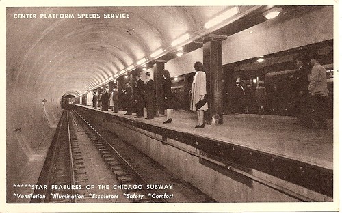
The system in an original configuration. Note the absence of benches.

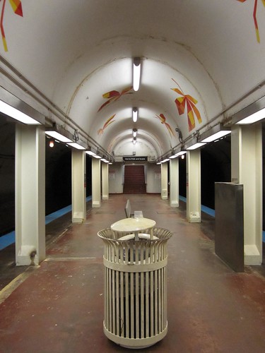
A mildly renovated red line station at Harrison. The lighting is not original configuration, but it is otherwise original.

An original station configuration. Note the lack of benches.

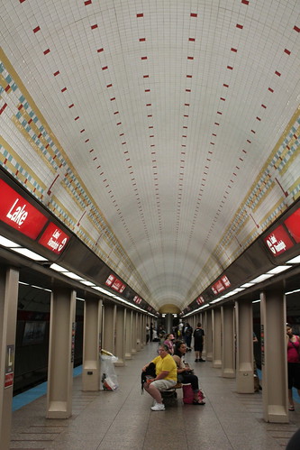
A red line station at Lake, renovated with new lights, tile mosaic, marble flooring, and new and more numerous wooden benches.
I have my own preferences for aesthetics, but I will leave it for the reader to decide which is preferable.
As Chicago's L increases in ridership and the city develops more densely, the case for more rapid transit will become more pronounced. The dialogue is only beginning with the CTA's renovation of some older stations. But it is one that needs to happen, because much of Chicago's transit infrastructure was built in the early 20th century or late 19th century. If a miracle occurs and the subways are extended, what should they look like and how much priority should be placed on aesthetics?
No comments:
Post a Comment