Karen Schultz lived in a seven-room apartment in Midtown's Cass Corridor for 35 years. She was kicked out in late 2013. "It was a really nice building next to Wayne State and the landlord is moving students in and out and increasing the rent," said the 60-year-old retired police department psychologist. She now pays $926 a month for a three-bedroom, up from $815 in her old place. She thinks she may have to move in with her daughter and her three grandchildren, who were also priced out of the old building.
This concatenates with the rather contradictory story about Detroit's expensive plan to remove derelict homes:
A task force convened by the Obama administration issued the most detailed study yet of blight in Detroit on Tuesday and recommended that the city spend at least $850 million to quickly tear down about 40,000 dilapidated buildings, demolish or restore tens of thousands more, and clear thousands of trash-packed lots. It also said that the hulking remains of factories that dot Detroit, crumbling reminders of the city’s manufacturing prowess, must be salvaged or demolished, which could cost as much as $1 billion more.
This begs the question "Why are some areas of the city rising in value while some areas continue to free fall?" But a closer examination shows a rather obvious correlation. First, the big picture.

It is unsurprising that the areas with fewer violent crimes are doing better than the high homicide areas. And indeed you can compare this map with the demographic map of Detroit and see something of an overlap where people are leaving.

The overlap is no surprise. But the crime map doesn't tell the whole story. One of the neighborhoods highlighted with rising rents is Cass Corridor in Midtown. This area has a walkscore of 91. Compare that to some of the neighborhoods with rising vacancy rates. Take, for example, this area of Palmer Woods, with a comparable homicide rate and an increasing vacancy rate: walkscore 42.
Continue your tour of Detroit to the Southeast side, another region where the crime rates are comparatively low but the vacancy rates are increasing. There you find a walk score of 45. While it is no surprise that the regions of the city with higher homicide rates have higher vacancy increases, the walk score factor has been surprisingly absent in the recent brouhaha over Detroit's multifaceted housing market.
In fact I encourage you to take a trip around Detroit with the walk score and see the correlation between decreasing vacancy and high walk score. This high vacancy neighborhood on the Southwest side, for example, has a walk score of 48. And another, this in the lower crime and lower vacancy neighborhood of Elmwood Park has a walk score of 69.
The areas of the city that seem to be doing the best are areas with a higher walk score and lower homicide rate. And the correlation between lower homicides and higher walk scores is evident as well. This is an important point that is missing in the analysis of many urbanists. Rather than making facile comparisons to globalization or ignoring market preferences for walkability altogether, urbanists should be connecting the dots. I've already highlighted the low rate of driving, car ownership, and drivers licenses of the youngest cohort. A simple conclusion is that increasing demand for safe walkable neighborhoods is ineluctable. And indeed such observations are omnipresent, even in highly blighted Detroit.
It is strange to suggest that people priced out of a low crime high walkable area simply move to a higher crime and lower walkable area as a reasonable solution to the problem! It is strange to make a moral judgement about market preferences.
Urbanists are not seeing the nuance in the demand and supply issues at the locus. Failure to differentiate between quality of housing stock and neighborhood characteristics has lead many urbanists to mistake demand issues for supply issues, or simply dismiss the demand issues. Indeed Detroit serves as a monolithic example of inelasticity in both supply and demand. This has lead to moralistic pablum such as referring to a retired police psychologist as a young urbanist, a part of the global workforce, or an entitled grouser rather than looking at empirical evidence. We could observe from the data provided that low crime high walkable neighborhoods in Detroit is an inelastic good, with a demand that is increasingly inelastic as well. Again, with the demographic numbers on younger Americans the demand elasticity is unsurprising. The pace of supply increases of low crime highly walkable neighborhoods is a subject well worn for good reason.
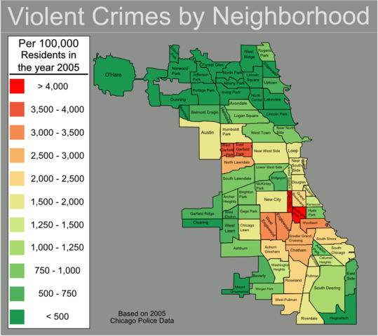
This issue is transferable to other cities. Take Chicago.
In Chicago the pattern looks familiar. This Englewood neighborhood has a walkscore of 71. Compared to the burgeoning Wicker Park area where the score clocks in at 89. As you can see, Wicker Park has both a lower violent crime rate and a higher walk score. If one continues this series with some of the sententious alternatives to Wicker Park you find the following:
Woodlawn: 55
South Shore: 75
Bronzeville: 72
Austin: 74
Note that these suggest alternative neighborhoods all have significantly higher violent crime rates as well as lower walk scores.

Indeed one author even went so far as to suggest Garfield Park as a reasonable alternative to Lakeview. Garfield Park is home to one of the most dangerous neighborhoods in America. Shamefully, some urbanists think violent crime is an unimportant statistic!